

How To Create A Colour Palette For Your Brand
A step by step tutorial on how to choose brand colors using an easy & fool-proof formula.
I was on a networking call last week when someone desperately asked me to explain colour palettes. She suggested I create a paid resource, or workshop on colour because she was really struggling to find pre-made colour palettes on Google that actually worked.
What..? People want me to talk about colours? It’s so obvious. There is no way that would be helpful to anybody.
Well, that’s where I was absolutely 100% completely wrong. Sometimes when you’re so zoomed into your expertise, things that feel intuitive are a massive struggle for someone else. So today, let’s chat about what colour means in your business, and how you can create a colour palette that is unique to your brand.
Why The Colours You Use Are Kind of a Big Deal
Designers are kinda like psychologists who weren't great at science and went to art school instead. I'm kidding. But believe it or not, psychology plays a massive role in design.
Designers understand the relationship between how people think and feel when engaging with specific elements like colour, layout, typography, and emotional triggers. Colour is a huge way that we communicate a look (romantic vs corporate) or a feeling (calming vs urgent.)
I (hopefully) shouldn’t have to tell you that red means stop, and green means go. We know what colour a lemon should be, and if it was any colour besides yellow we wouldn’t eat it. That's basic colour psychology.
Every colour has meaning and emotion attached to it. That means the colours your business uses evokes an emotional response in your audience (whether they’re aware of it or not), so we want to be sure that we’re intentional about the colours that we use.

What makes a successful brand colour palette
When it comes to using colour in your business, there's a few things we need to be considering. A successful brand palette:
Is used consistently, so people associate your brand with those colours
Is unique, memorable, and stands out in the marketplace against your peers
Versatile across digital and print mediums (not all the colours on your computer have a print or Pantone match)
Accessible with enough contrast between text and background colours
Most importantly, your colour choices resonate with your target audience (for example, if you're a bank wanting to gain public trust, you'd choose a confident blue over pastel pink.)

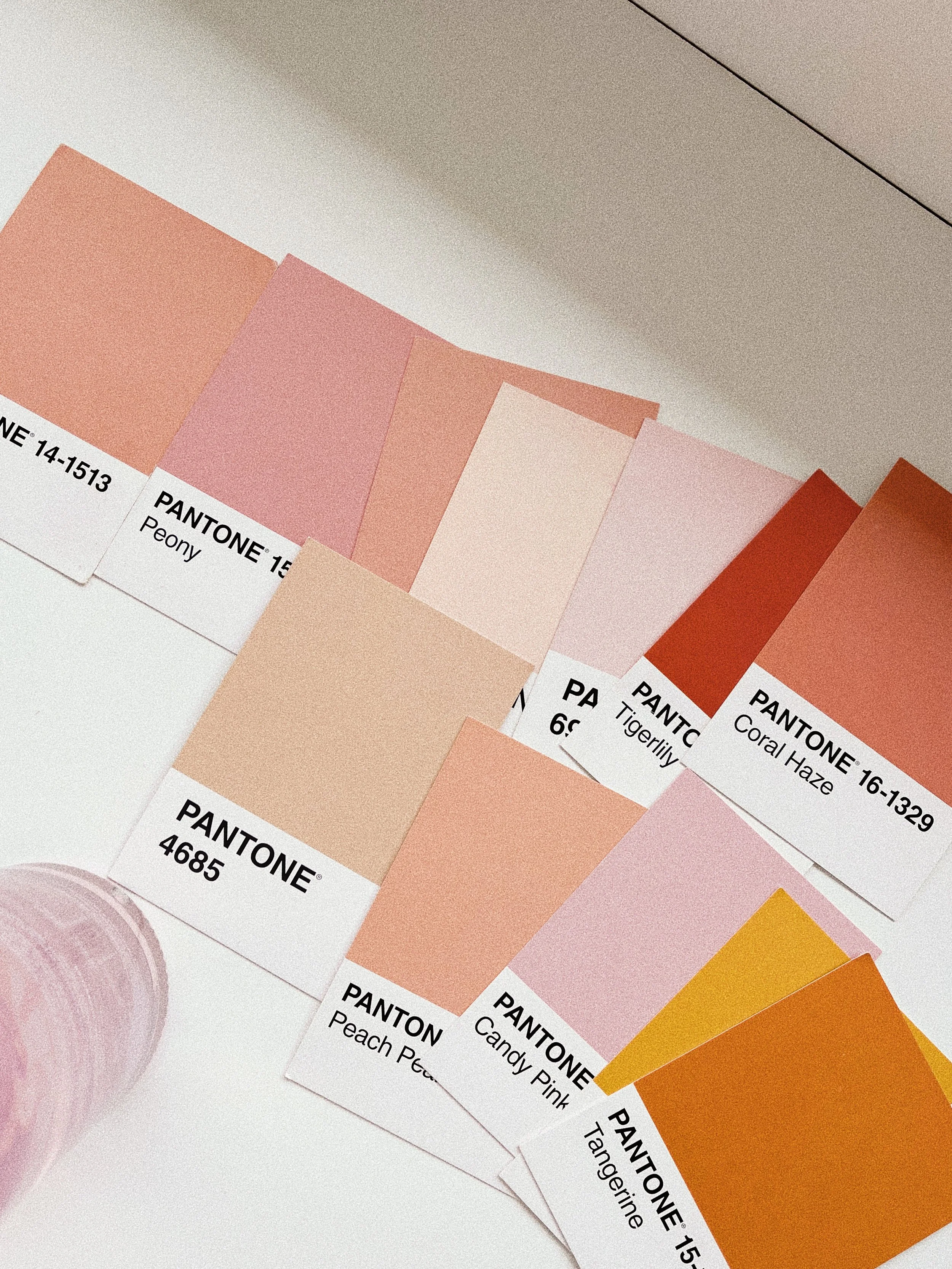
Why do Pinterest colour palettes suck so much?
Have you been a victim of the Pinterest palette? You find your colours, bring it into Canva only to realize it would have been easier to solve the DaVinci code.
The problem with most of the colour palettes online is that they're just curated colours that look nice, or are meant for different applications like art or interior design.
These palettes aren’t (usually) made with branding in mind. This means:
They don’t have enough contrast, making things hard to read
There isn’t enough variety in the palette (it's kinda hard to use 5 shades of blue)
There’s no rational behind the colours chosen beyond aesthetics
Print wasn’t considered, and colours may be out of range, which sucks after you spent 20k on packaging
They’re trendy, used by tons of businesses and risk becoming quickly outdated
So yeah, all those things are kind of a bummer but that's okay, cause I'm going to teach you how to make your own.

How to DIY A Brand Color Palette
that's versatile, intentional and unique to your business
Okay, here’s my (general) formula for creating a fool proof palette. If you follow these steps you can create a balanced and functional palette that’s strategic and unique to your brand.
Step One // Choose Your Base Colours
Pick your main two colours that will be used the most often, we’ll call these your base colours. Choose one light, and one dark. Choose colours based on your audience, and not personal preference. If you really want to be intentional about things, you can research the meaning behind your colours. Don’t forget to check for contrast using a tool like this.
Step Two // Choose 2-3 Accent Colours
These can be bolder colours used to highlight or draw attention to something (like website buttons) or more playful colours that reinforce your brand's values or personality. You want to make sure they look good paired with your base colours so that everything works harmoniously.
Step Three // Test your Palette
Experiment with different colour parings within your palette and ensure that text and graphics are easy to read, and check your pairings with the same tool used earlier. Make note of the hex codes in your palette and type them out and save somewhere safe.
Step four // add to your brand kit
If you have Canva, or Adobe Express make sure to add the correct hex codes to your brand kit so they’re always there when you need to make content. Stick to these brand colours consistently so that your audience begins to associate those colours with your brand. Switching your colours frequently confuses your audience and erodes trust.
If you’re a visual learner like me, here’s some examples of past colour palettes I’ve created using this formula.


If you want more tips just like this sent directly to your inbox, subscribe today!
This tutorial was just one of the emails I sent out in The Kind Exchange - a weekly newsletter where I share one business tip, once a week for a brand that connects (and converts).

I’m Shaylyn, a one of a kind designer that prioritize human-connection above all else.
What does that really look like? I design with your audience in mind so that your brand resonates with the people you actually want to work with (not the hagglers, not the price shoppers).
I don’t believe in surface level design, so I’ll walk you through my signature process that’s so in-depth and introspective, I promise you’ll walk away with an entirely new perspective of your business.
I can proudly say that after working together, every single one of my clients instantly felt more confident in their business, attracted aligned clients, and felt 100% justified raising their prices because finally understood their value.
Wether you’re starting from scratch, or ready to elevate what’s already in place I’m here to help you find what makes you special and then make sure we tell the whole world.