

roots & shoots
Creating a fresh, approachable brand for a farm-to-table business that connects health-conscious city dwellers with locally grown, seasonal produce.
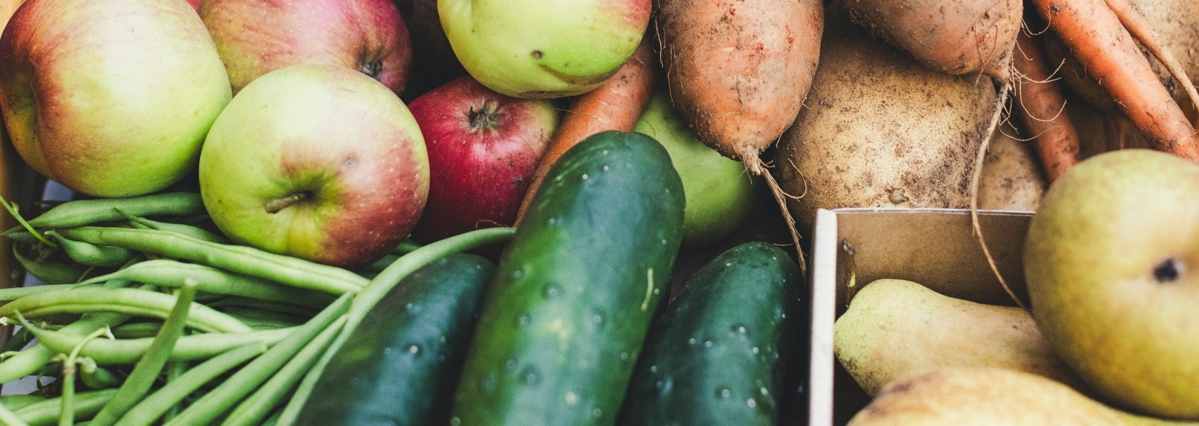
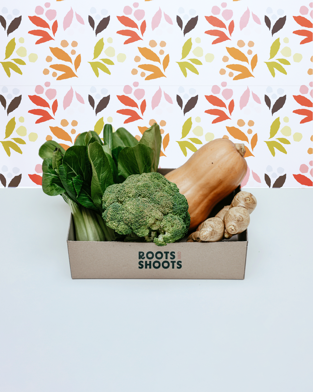
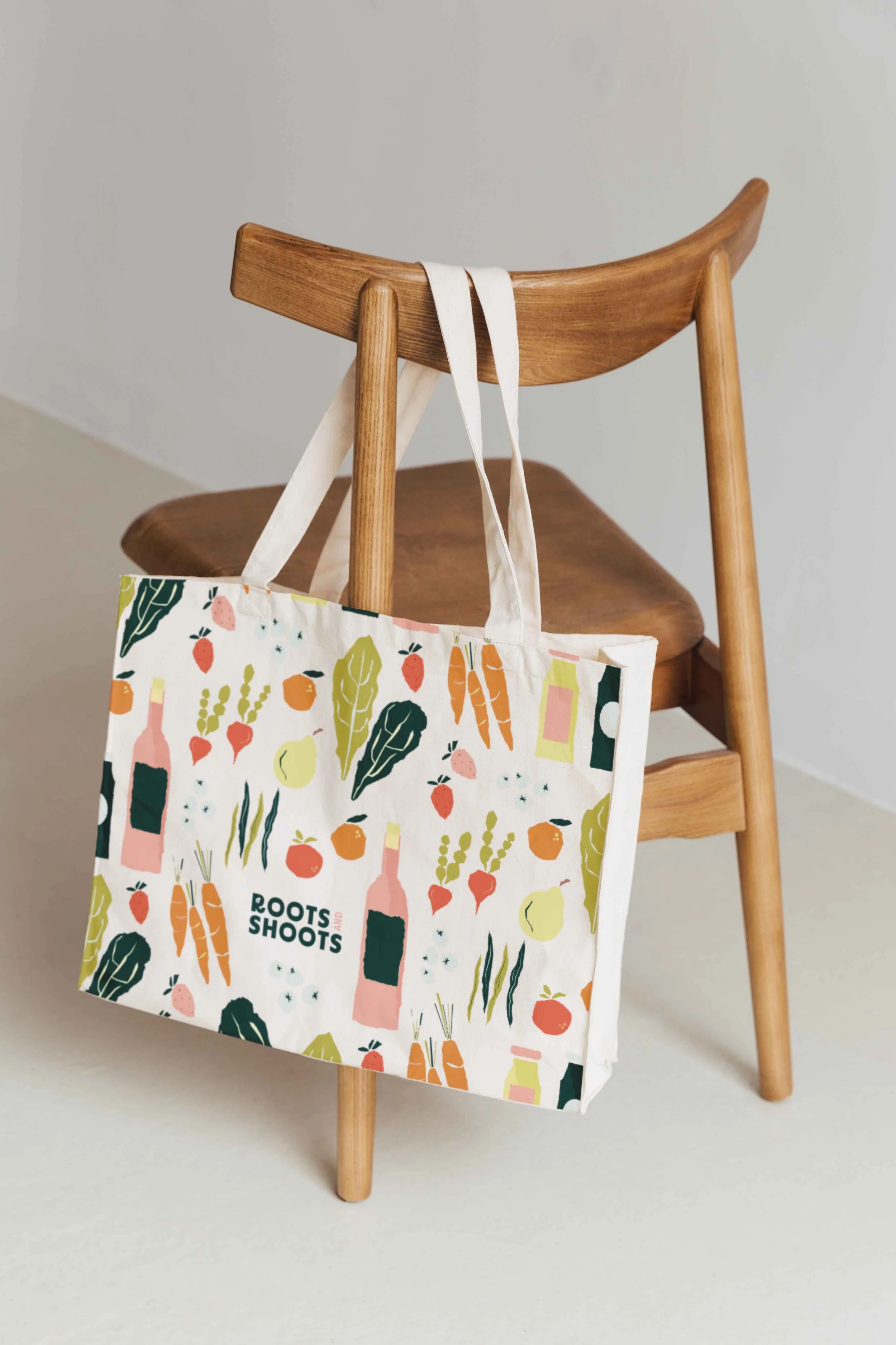
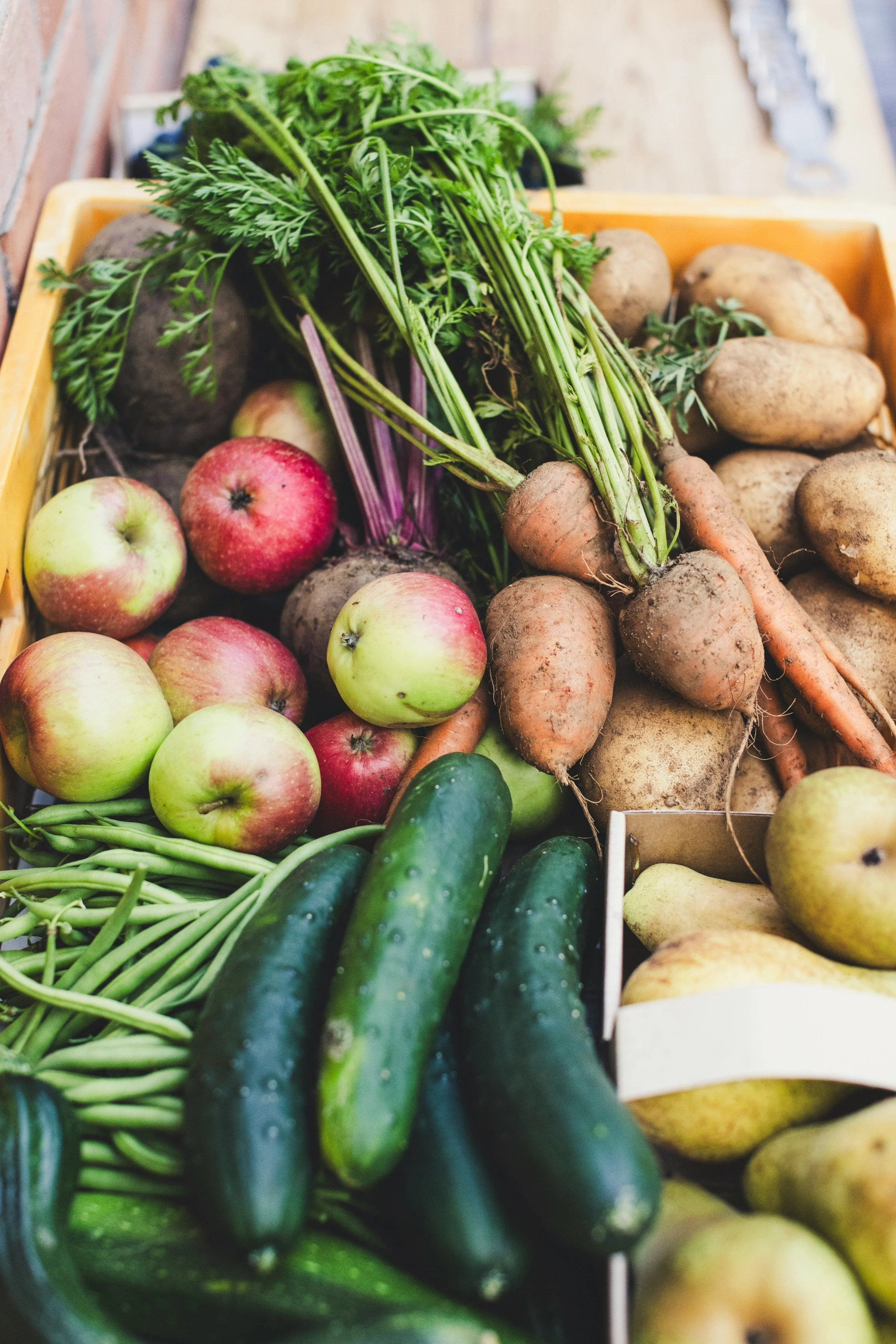
The Roots & Shoots brand design is fresh, approachable, and down-to-earth just like the food it represents. Hand-drawn produce illustrations highlight the focus on real, locally grown food, while deep greens and pops of organic colours are inspired by the garden and reinforce its farm-to-table values. The bold, friendly lettering makes everything feel clear, welcoming, and easy to connect with.
This design isn’t just about selling produce, it’s about building a connection with people who care about where their food comes from. It feels like something you’d find at a local farmers’ market: simple, fresh, and full of personality.
Project Type: brand Design | Logo Design
Vibe: Colourful, playful, organic
Industry: food & beverage, farming, food delivery


Inspired by this brand?
We could create something just as strategic and distinctive for you through our aligned & authentic brand identity service. I’d love to chat. Click below to schedule a free no-strings-attached discovery call today.
more work
-
![Norwood Kids Childcare]()
Norwood Kids Childcare
-
![Primrose Event Planning & Design]()
Primrose Event Planning and Design
-
![WCEM]()
WCEM
-
![A Petal For Your Thoughts]()
A Petal For Your Thoughts
-
![The Oasis]()
The Oasis
-
![Open cardboard box with fabric or paper wrapped items, folded with striped pattern in navy, beige, and white, and a small round label that reads 'Little Acre.']()
Little Acre Flower Farm


