


Brand Strategy & Identity Design for a Purpose-Driven Business Consultant
The Challenge:
A business consultant whose reputation outpaced her brand — no visual identity, no positioning, and incoming opportunities she didn't feel ready to meet.
The Outcome
A complete brand identity system delivered in eight weeks that gave her the confidence and credibility to show up for those opportunities.
“Right now, people seeking me out for work, but it feels like someone’s arriving at your door when you are still in your pyjamas”
Cultivate Business Solutions helps organizations untangle complex business problems through a pragmatic way so that they can fall back in love with their business.
A full client roster meant that she didn’t have time to dedicate to her own business, struggled articulating a vision and committing to an aesthetic. She was ready for a strategic approach so that her brand prepared her for future opportunities and attracted value-aligned clients.
The brand was a complete blank slate with no logo, colour palette, or visual language. What Gina did have was a clear sense of her values, and a business name that was chosen with intention. I walked Gina through an introspective briefing process that helped us develop a unique business position and visual identity that is an authentic reflection of Gina and Cultivate Business Solutions.
Project Scope
This was a full brand identity build from the ground up. The scope included a logo system, secondary icon set, brand pattern development, a complete colour palette, typography system — all delivered within an eight-week timeline.
Beyond the visual assets themselves, the in-depth brand manual I created protected Gina’s investment and ensured that she could use the brand confidently on her own.
Every deliverable was designed to work as a modular system: the individual elements can function independently or together, giving Gina the flexibility to apply her brand consistently across a website, slide decks, business cards, email signatures, and future marketing collateral as her business continues to grow.
project Timeline: 8 Weeks
in-depth brand workshop
research & brand strategy development
conceptual development
logo system
secondary icon set
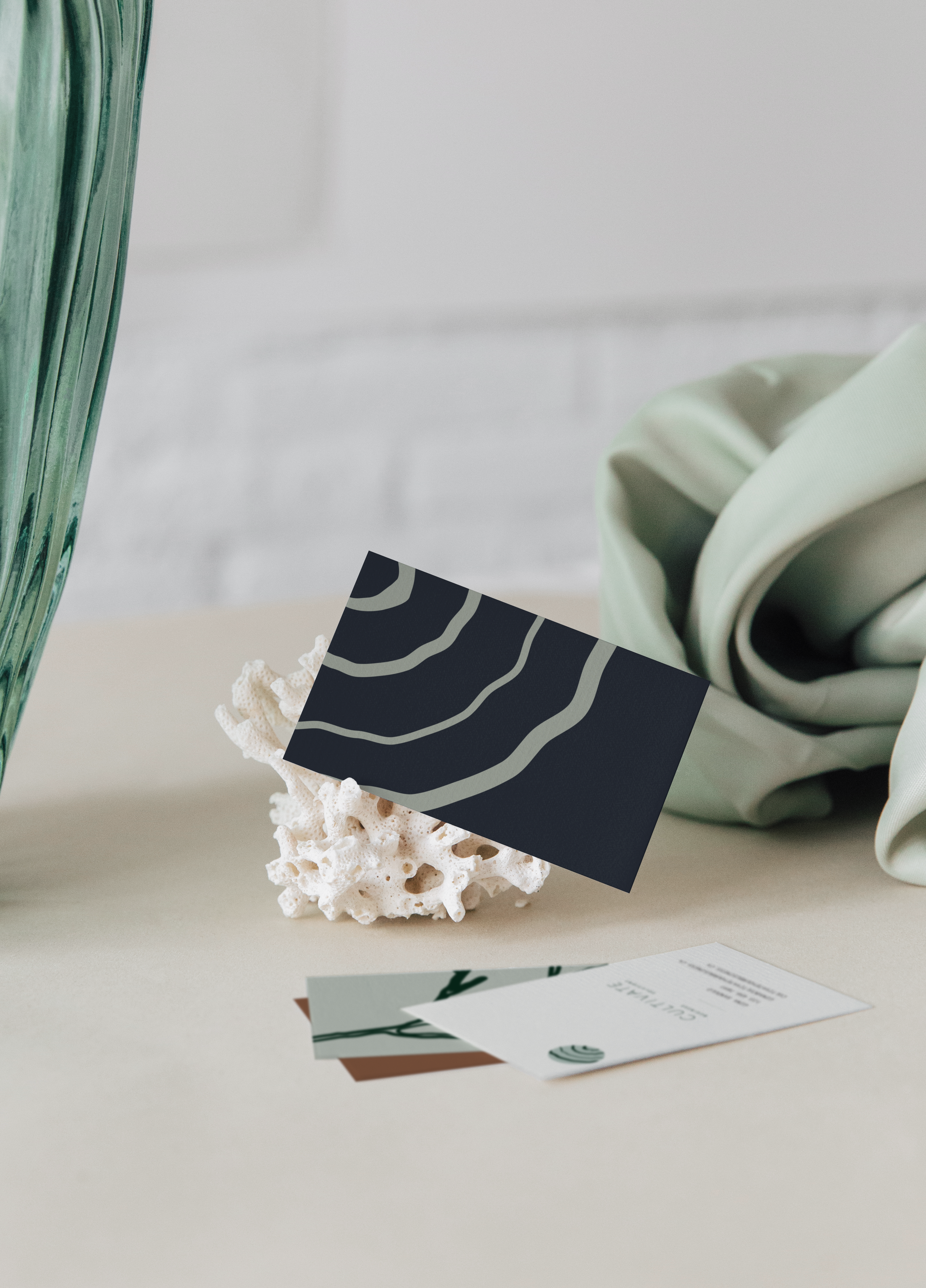
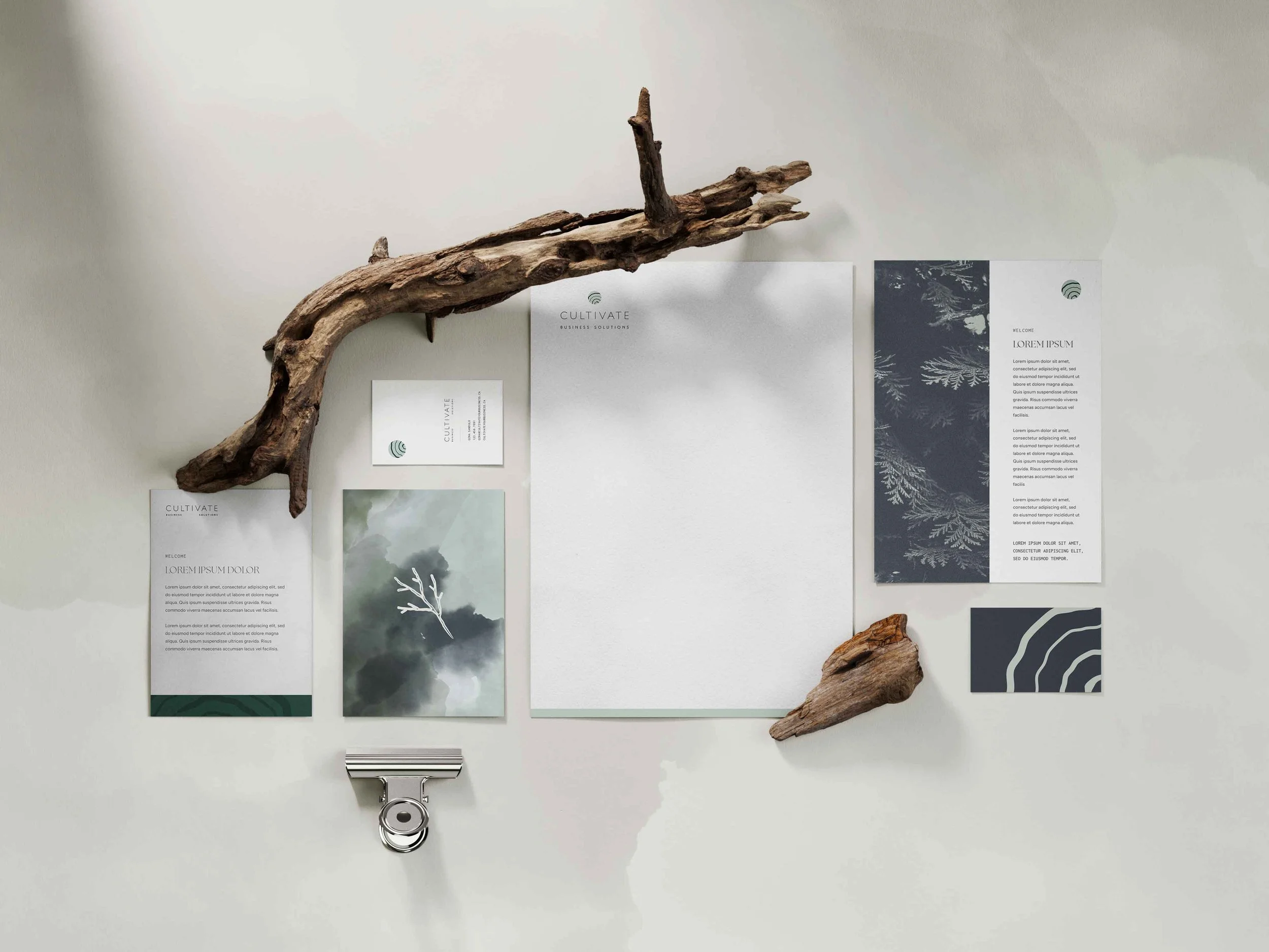
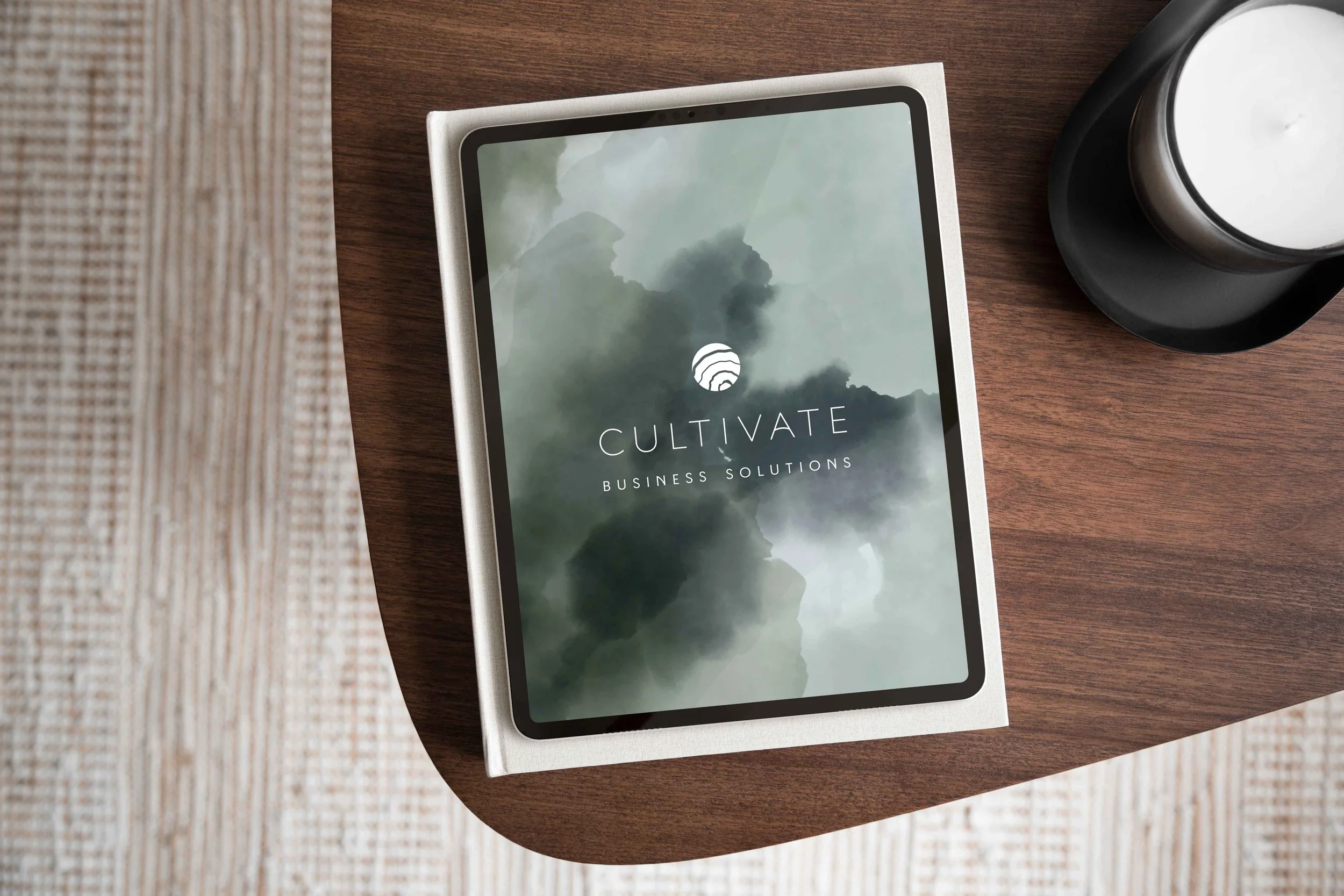
The Cultivate Business Solutions logo is a modular system made up of an icon and wordmark that can be used together or independently, repositioned and scaled across any context without compromising integrity or recognizability.
This was a deliberate strategic choice, not just a aesthetic one. The Cultivate Business Solutions brand needs to live across a wide range of touch points — from a small website favicon, to a corner mark on a slide deck, to a header on a business card.
A logo that only works in one configuration creates inconsistency over time, and inconsistency erodes client trust. A modular system ensures that no matter where the brand appears, it still looks and feels like the same brand. This reinforced visual consistency makes a business look established, credible, and intentional.
Colour is the fastest communicator in any brand system. Before a potential client reads a headline, they've already had an emotional reaction to the colours on the page.
For Gina's audience (business owners dealing with stress, uncertainty, and high-stakes decisions) the palette needed to signal a calm authority rather than urgency or performance.
Deep greens and blues communicate trust and stability. Earthy ochre, off-white and mint bring a crisp freshness and approachability to the system. Working together, this palette positions Cultivate Business Solutions as a brand that feels both professional enough to take seriously and human enough to want to work with.

The Cultivate Business Solutions icon is made of concentric circles, inspired by tree rings, water ripples, and topographic maps.
It communicates growth, resilience, and depth without relying on obvious visuals or generic plant-like imagery. This abstract approach makes the brand feel intelligent, memorable, and credible, while staying fresh as design trends evolve. It’s also completely unique in Gina’s peer landscape, helping her stand out within her industry.


After working together, business owners stretched thin will find invigorating clarity that feels like stepping outside and taking a deep breath of fresh, coastal air.
We visually communicated this this transformative story through a sensory, outdoor-based lens.
Hand-drawn inky, imperfect icons add an honest and human element to the brand. These icons are inspired by the Pacific North West and share a common theme of growth and cultivation. These icons are completely unique to the brand and efficiently communicate abstract concepts and support the brands storytelling.

“I feel like I have something to build from.”
"I was worried I wouldn't be able to articulate what I wanted my brand to feel like — but Shaylyn asked exactly the right questions that helped me better understand what I was looking for, and paraphrased back what she heard to make sure we were aligned.
Her process is the perfect balance of streamlined and personal; I could go back and re-watch her recorded explanations as much as I needed to, which worked really well for me as someone who needs time to process.
Now that the project is complete, I feel like I have something to build from. A woman recently looked at my business cards and said, 'Wow, I love your branding' — and how great is that?!"
Gina sandulo | cultivate business solutions

More Portfolio Projects

studio nkc
Branding for an Interior Design Studio
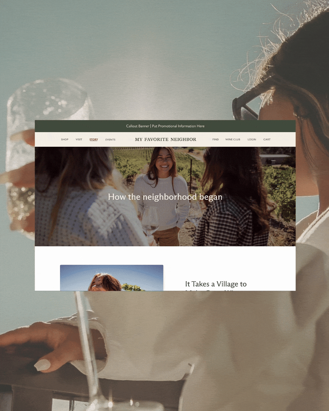
my favorite neighbor
Website for a California -Cool Winery
Forte studios
Branding for a Edmonton Photographer
I’m Shaylyn, a (one of a kind) graphic designer who builds brands that connect with people above all else.
For more design goodness or to stay in connected, choose your own adventure:
View my portfolio to read more case studies on how I’ve transformed businesses with design
Read my blog for free branding insights or subscribe to my newsletter for marketing tips.
Check out my service page to learn how we can work together to grow your business
Check out my service page to learn how we can work together to grow your business
Introduce yourself and start your project today