


Forte Studios Brand Strategy & Design
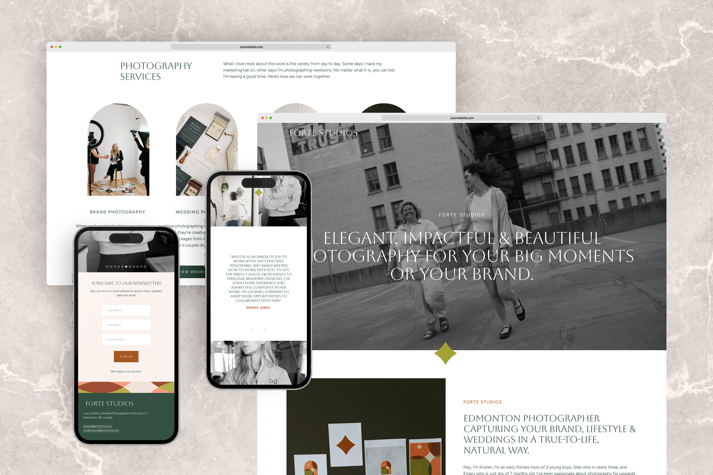
Designing a unique brand identity for a photographer in Edmonton that brought cohesion to all her marketing materials, making it easier to attract high-quality leads and promote herself online.
Kristen had built a successful business and personal brand, and after years of doing everything herself she wanted to invest in her brand. She was looking to create a cohesive, professional image and had specific goals about the type of clients she wanted to work with, and knew that it would take more then Canva to attract them.
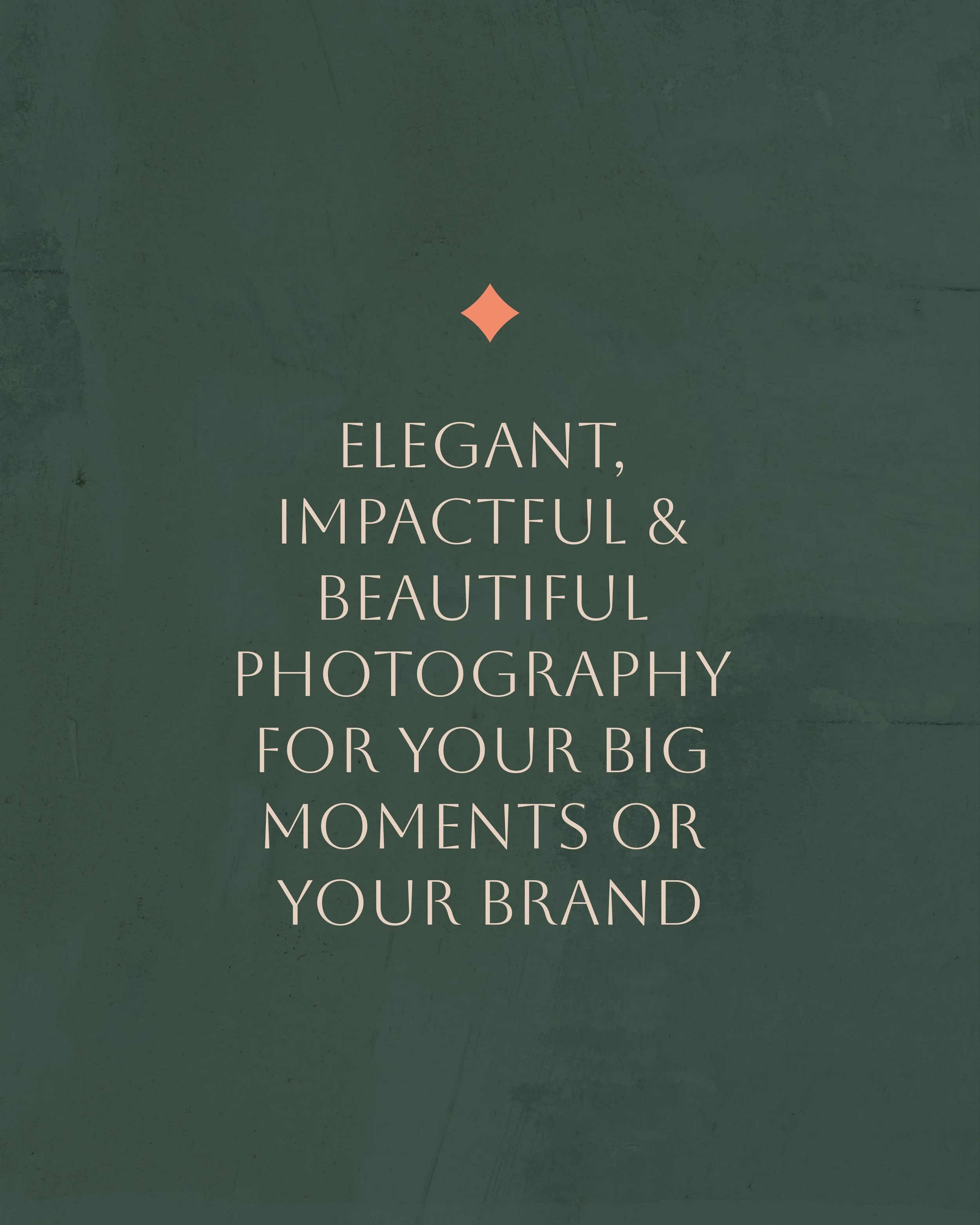
My mission was to create a meaningful, elevated brand that resonated with people looking for a warm, friendly, photographer—someone who can take the lead and leave them feeling confident, comfortable, and completely themselves in front of the camera. With a huge focus on client care, and a background in counselling, it was important that the visual identity was not only professional, but also felt warm and inviting.
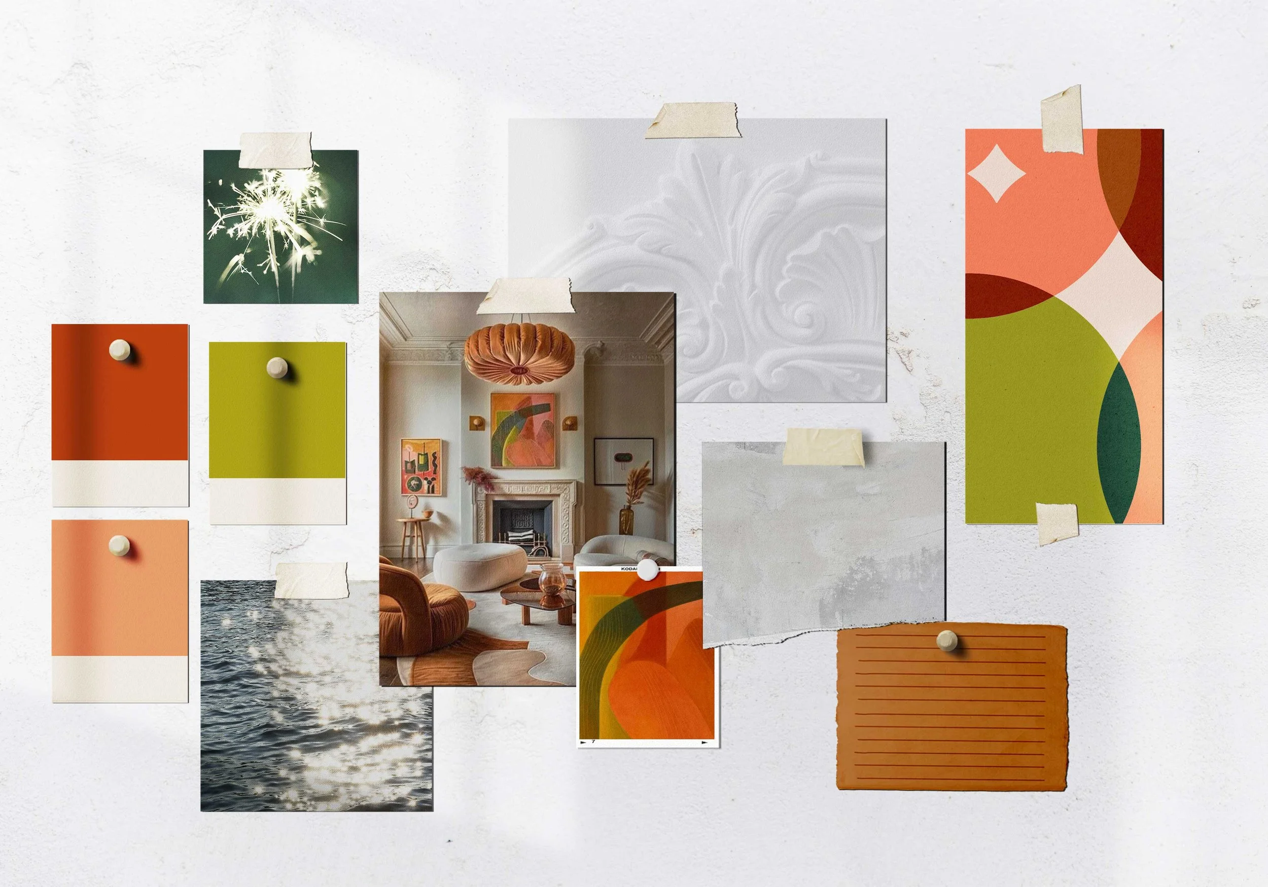
The brand weaves in personal elements of Kristens story, such as motherhood, confidence, and community. The creative direction was inspired by light, and a mix of new (funky) and old (vintage), in a way that felt timeless and is completely unique to Forte Studios.
This brand now serve as the foundation for her to build upon future growth and marketing plans, while also becoming instantly recognizable and unique within the market.
Vibe: ELEVATED // WARM // VIBRANT // FUNKY // FRIENDLY
Project Type: Brand strategy, brand design, logo design
Industry: Photographer // Wedding // marketing


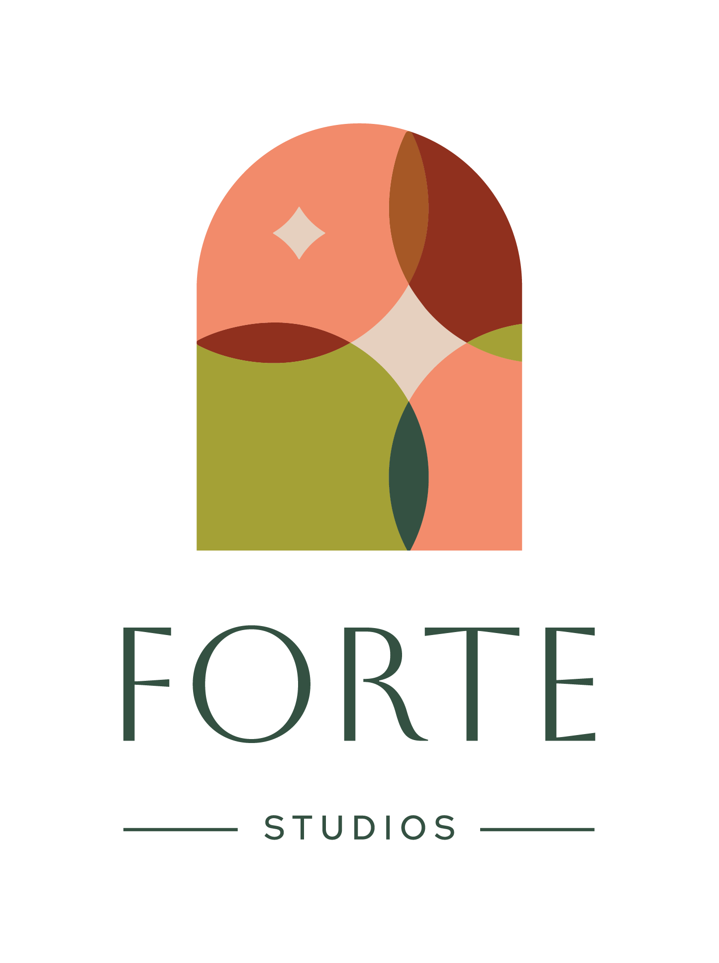
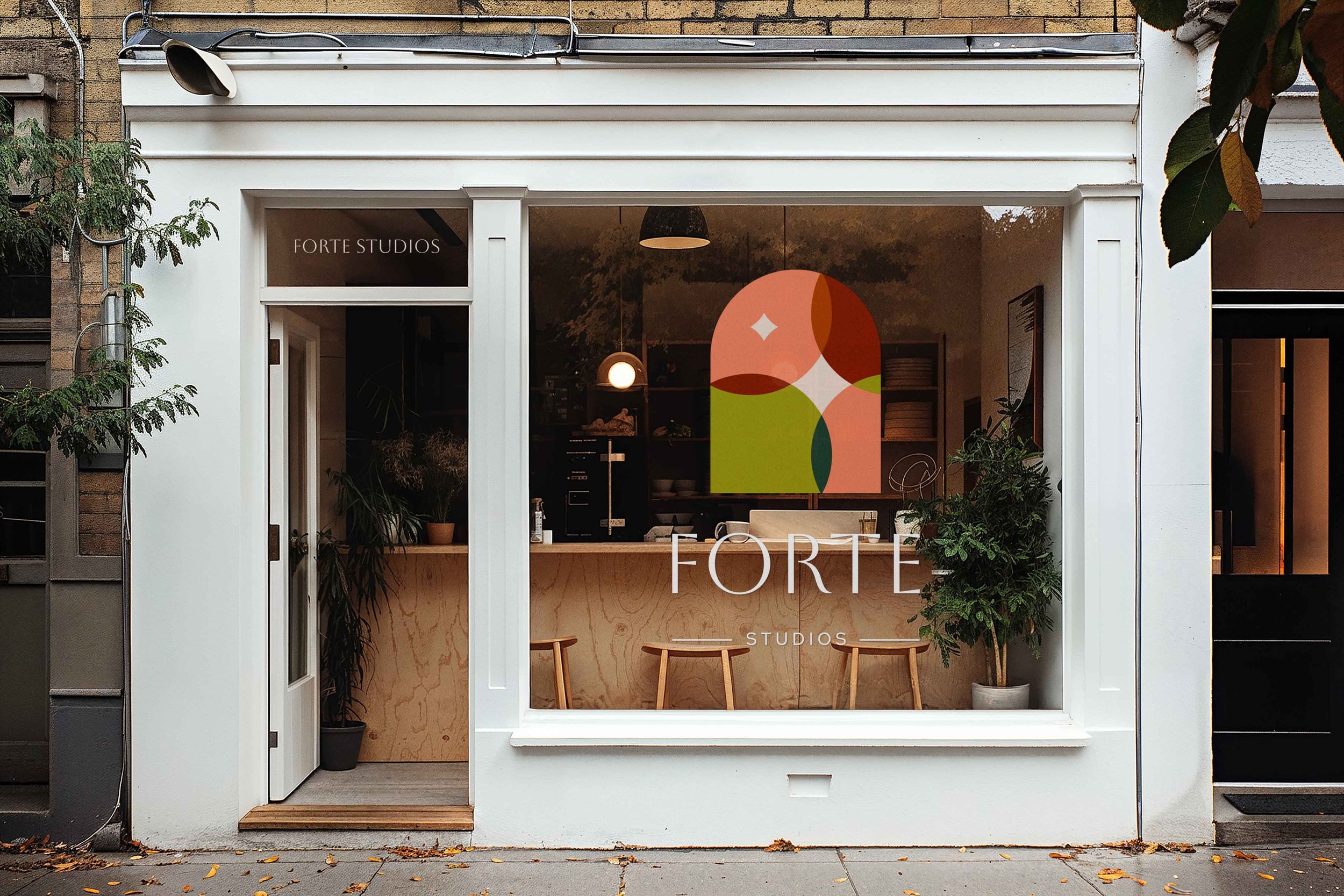
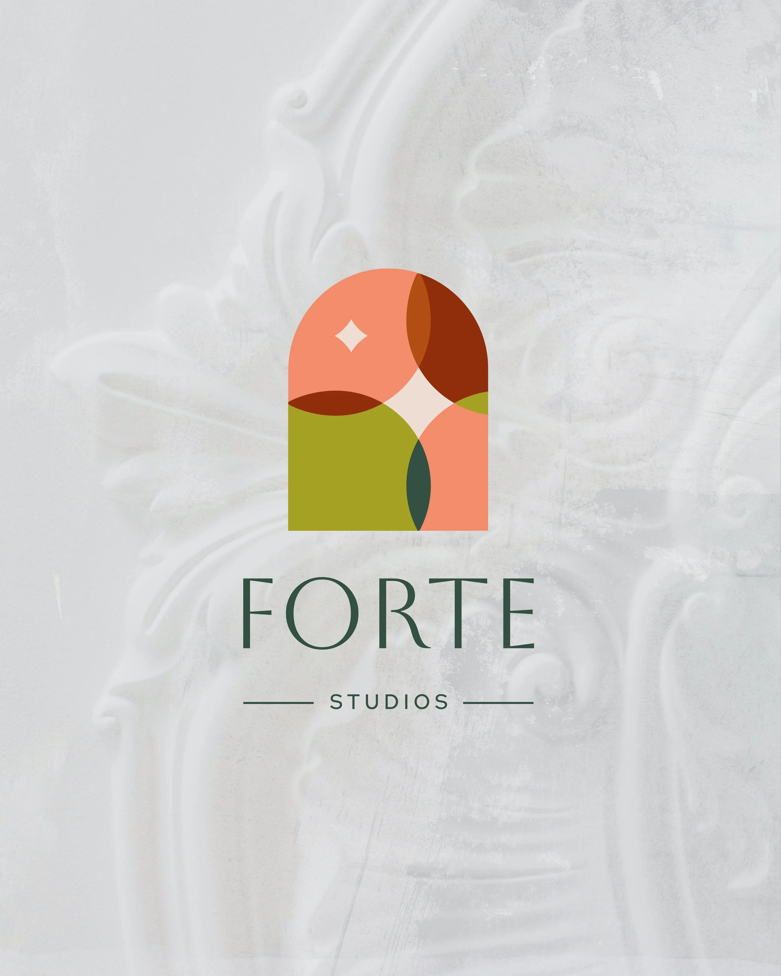
The Forte Studios icon is full of meaning and represents a photographer that is warm, authentic and cares about the community around them.
The pattern is framed within an arch. Arches are used in architecture for aesthetics, but also structural integrity. They symbolize support and presence.


Working with Kind was such a creative, fun, and eye opening experience. It’s made showing up online so much easier and using my logo across different parts of my business felt like a true level up!
Before working with a designer I was worried if I invested in a service and the results weren’t something that felt like 'me', how I'd deal with that or feel about that? Thankfully that didn’t happen because Shaylyn is so knowledgeable in the construction of what goes into a brand.
She touched on so many areas of my business, but also who I am as a person and incorporated that into the big picture. Shaylyn is truly a mastermind in her field and told my story so effortlessly through my brand.
I've had lots of people compliment my logo, colour palette, and my website. I feel like my new brand and overall professional presentation makes me stand out in my industry!
kristen huggett pittman | Forte Studios Photography
strategy notes
The inner pattern was created with four overlapping circles, representing community, mentorship and connection.
Two sparks appear in the pattern—one representing each of Kristen's boys, and together highlighting the confidence she sparks in clients by making them look and feel their best.
Strategy notes
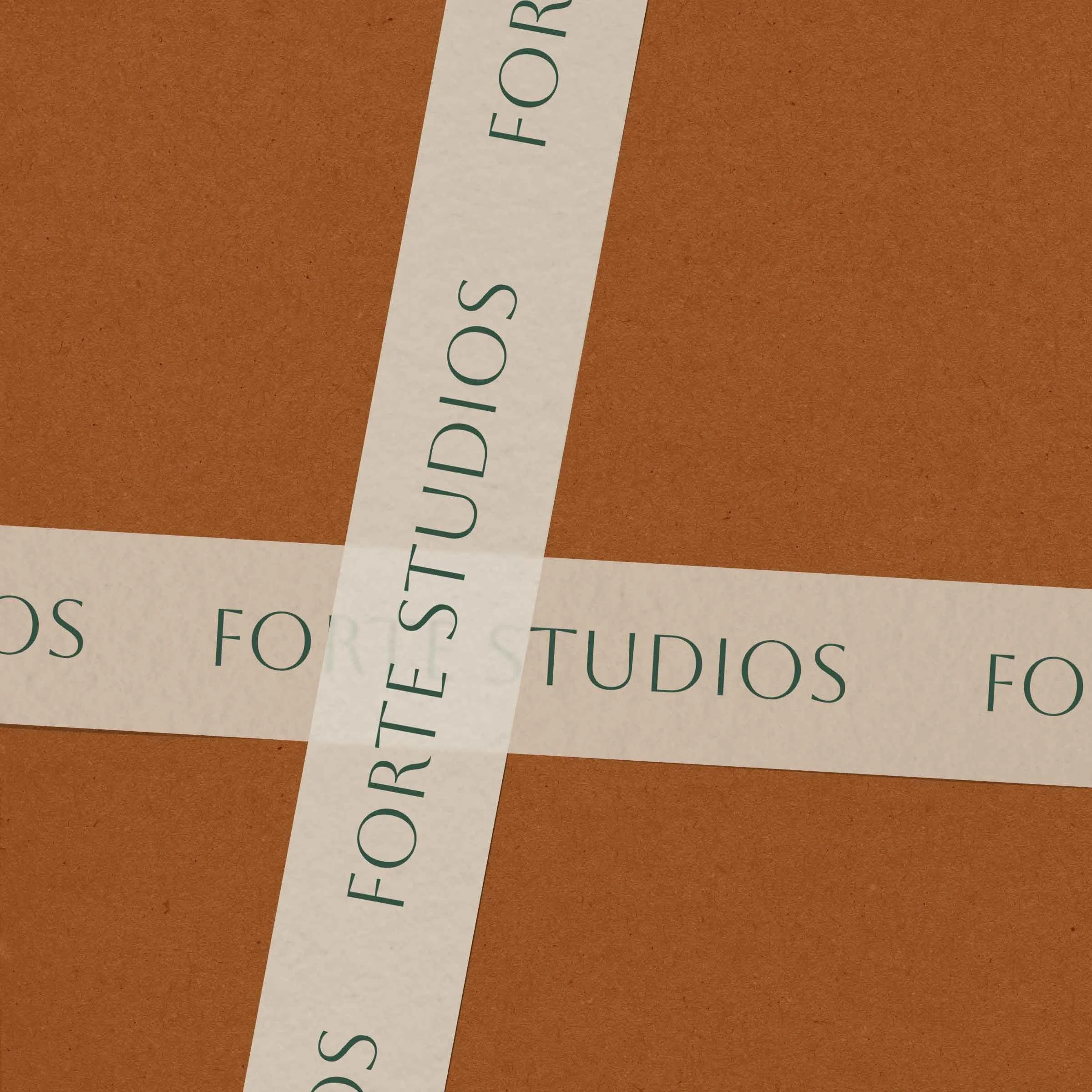
Careful attention and care was given when selecting the typeface for Forte Studios.
The selected font had a perfect balance of old and new. It’s a modern typeface based on a early Renaissance alphabet by a 15th century Florentine sculptor, and fit beautifully into the architecture metaphors of the brand.
say GOODbye to brand envy
Let’s design a beautiful brand that’s all yours.
My favourite portfolio projects

studio nkc
Branding for an Interior Design Studio
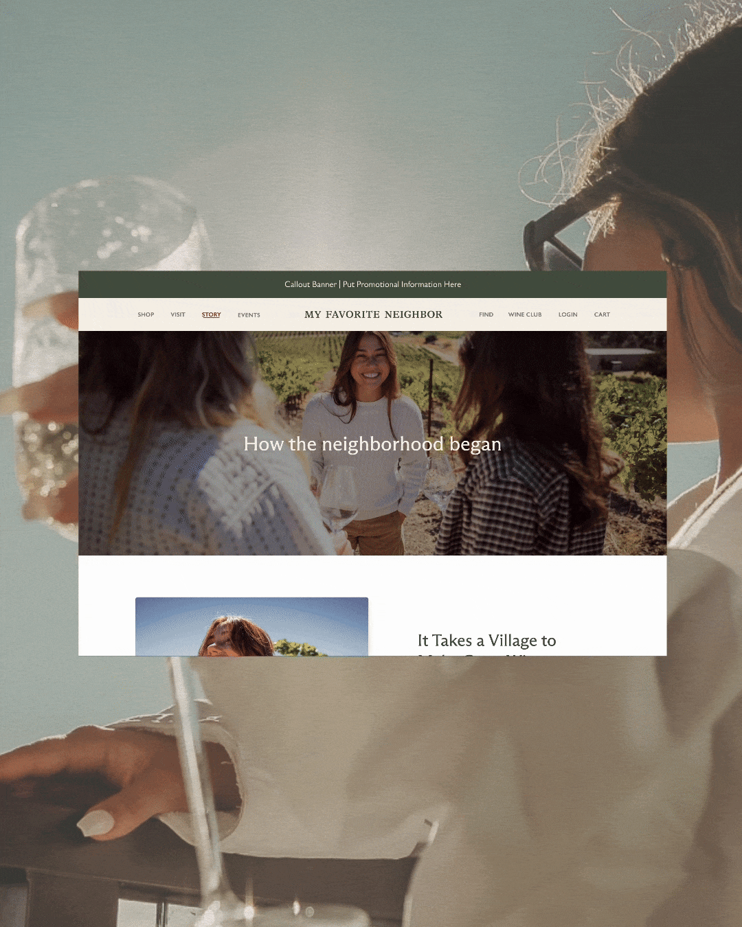
my favorite neighbor
Website for a California -Cool Winery
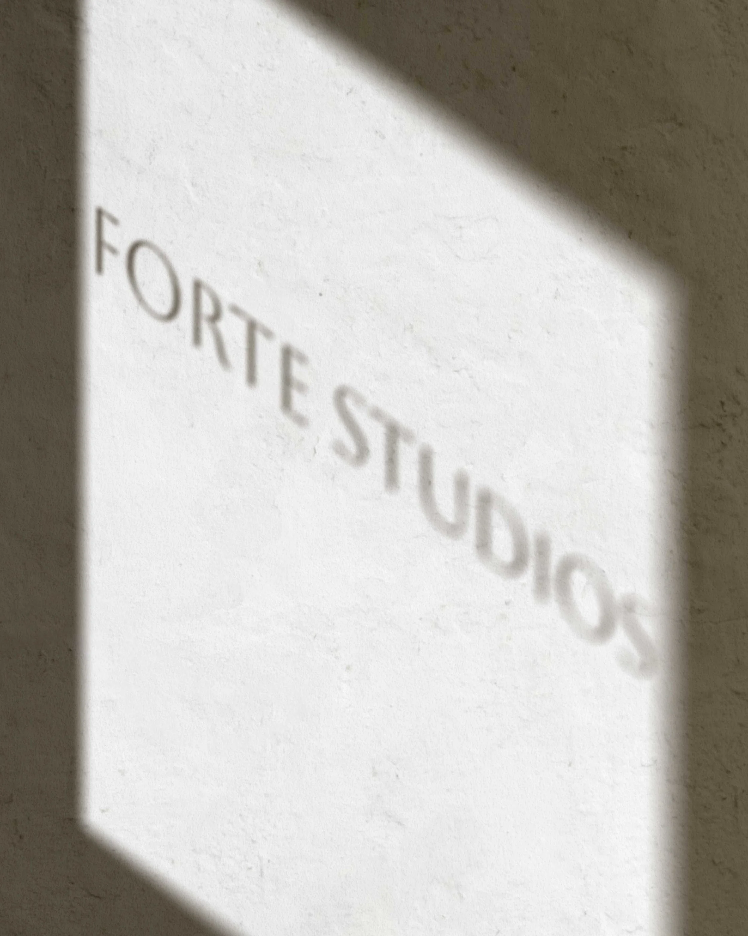
Forte studios
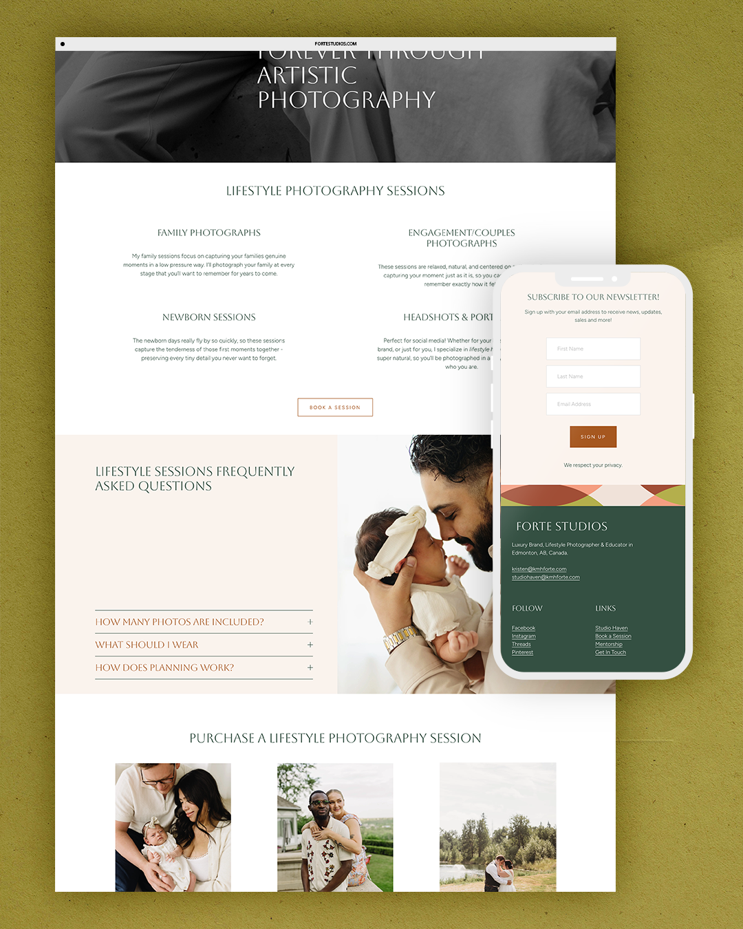
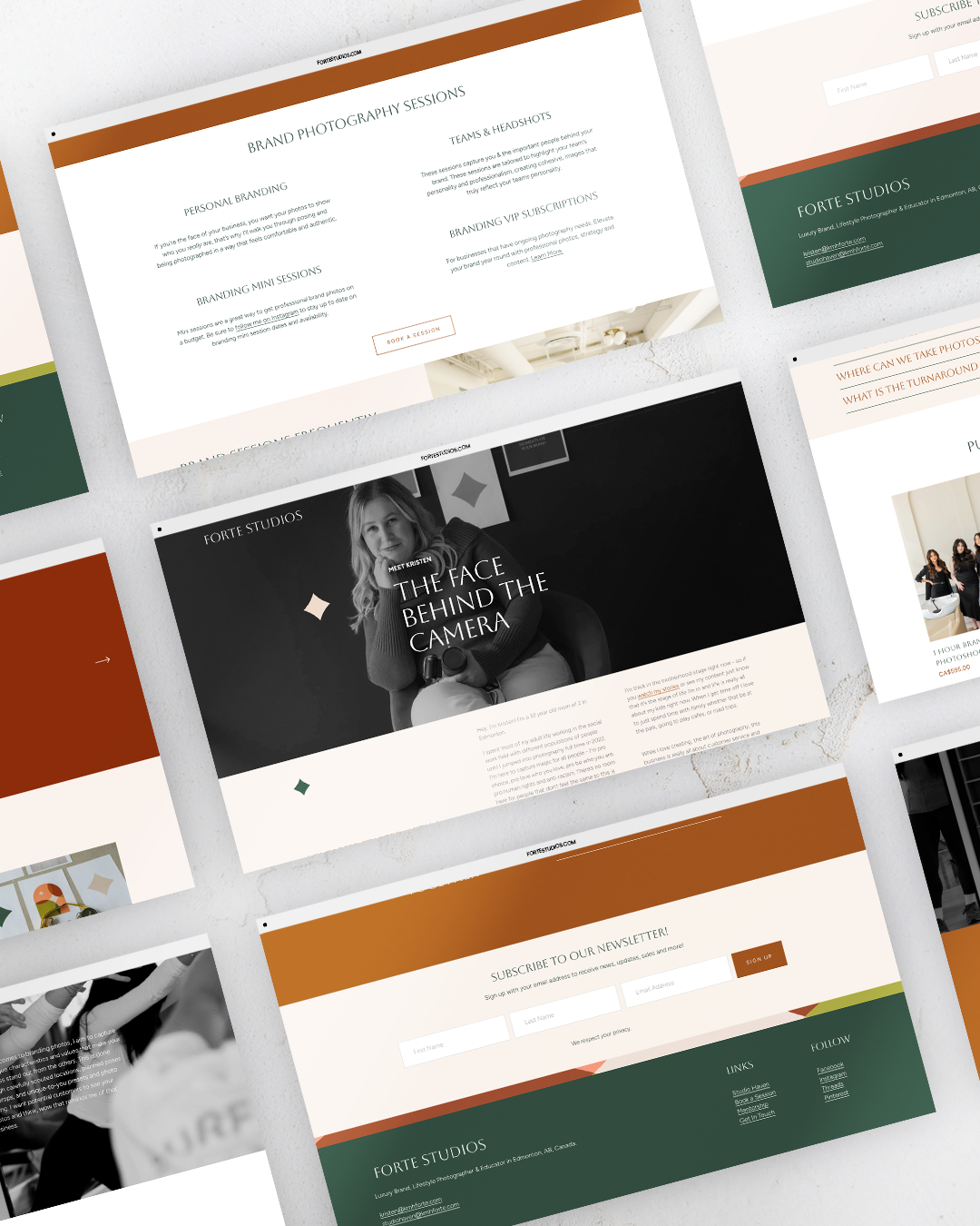
Branding for a Edmonton Photographer

I’m Shaylyn, a (one of a kind) brand and web designer who works with heart-led, intentional businesses. My goal is to make it easier for you to grow with integrity, confidence, and ease.
Through intentional brand strategy and the perfect combination of beautiful, yet meaningful design, I’ll make your ideal clients instantly feel like you’re a match made in heaven.
If you want to stay connected you can:
View my portfolio to view past work, and client testimonials.
Read my blog for free branding insights and tips
Check out my services for all the awesome ways we can work together on your brand or website (I promise to be the most fun expense you submit to your accountant)
Download my service & pricing guide to get a feel for what working together looks like..
Or you can always just send me an email, or schedule in a free (no awkward, no strings attached) discovery call to see how I can help you with your brand.
Choose your own adventure, and whichever you choose, I hope you have a beautiful day. ☀️