

Brand Design for studio NKC interior design
The Challenge
Interior design in Vancouver is one of the most saturated, visually competitive markets in Canada.
Nicole Caputo built Studio NKC on referrals and results — but her brand wasn't keeping up. Interior design in Vancouver is one of the most saturated, visually competitive markets in Canada, and most studios default to the same look: cold, minimal, luxury-adjacent. Nicole's approach was the opposite. She wanted clients who'd never worked with a designer before to feel immediately at ease — not intimidated, not priced out before they'd even had a conversation.
"I want people to feel comfortable with me so that we can break down those barriers — so that clients can laugh when they're sitting on toilets to try them out."
The problem was that without a brand, none of that came through. She knew exactly who she was and how she worked. The world just couldn't see it yet.

the process
Strategy first, Aesthetics Second
We started with an in depth brand strategy workshop— understanding Nicole's audience (design-curious homeowners who want their space to feel like them, not a showroom) and her competitive landscape (studios leaning heavily into luxury minimalism). That gap became the opportunity.
From there, every creative decision was made through two lenses: does this stand out in the Vancouver interior design market, and does this feel like someone Nicole's ideal client would want to invite into their home?
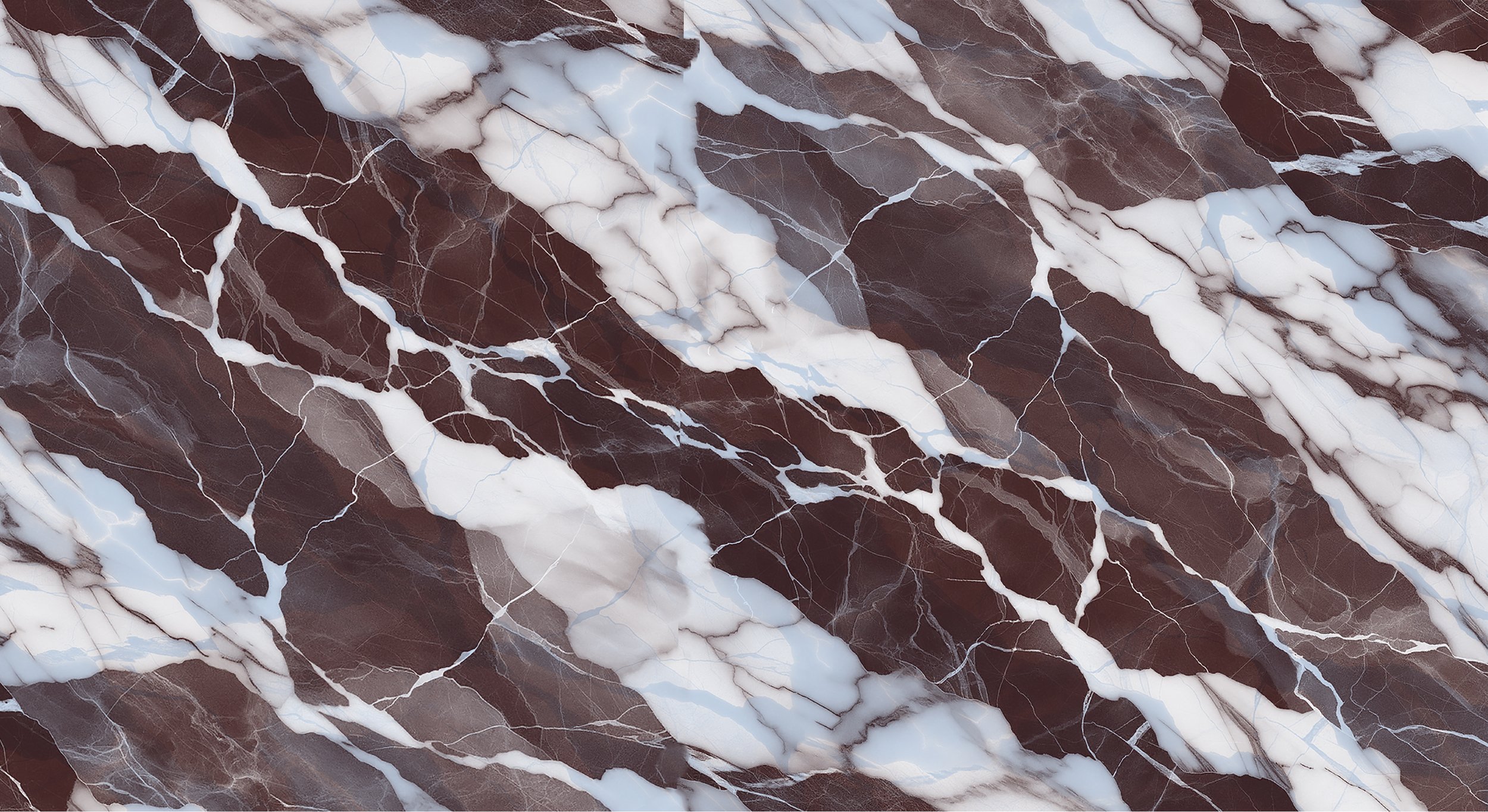
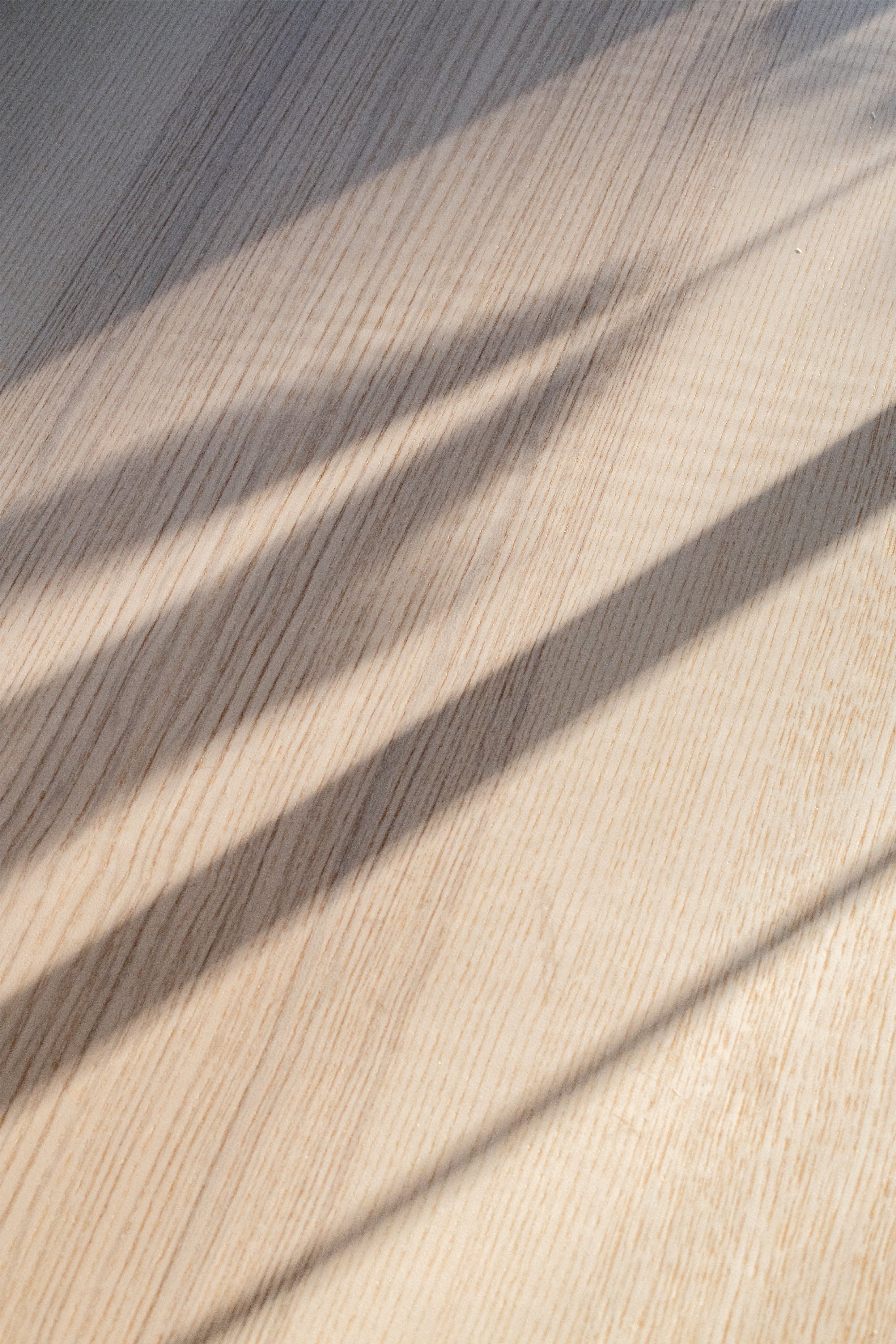
Nicole's deep love of midcentury and Italian design became the creative foundation as a genuine reflection of her aesthetic point of view, translated into a brand system her clients could recognize and trust.


The Outcome
A full brand identity system built around two ideas: confidence that doesn't feel intense or intimidating, and personality that's authentic and irreplicable.
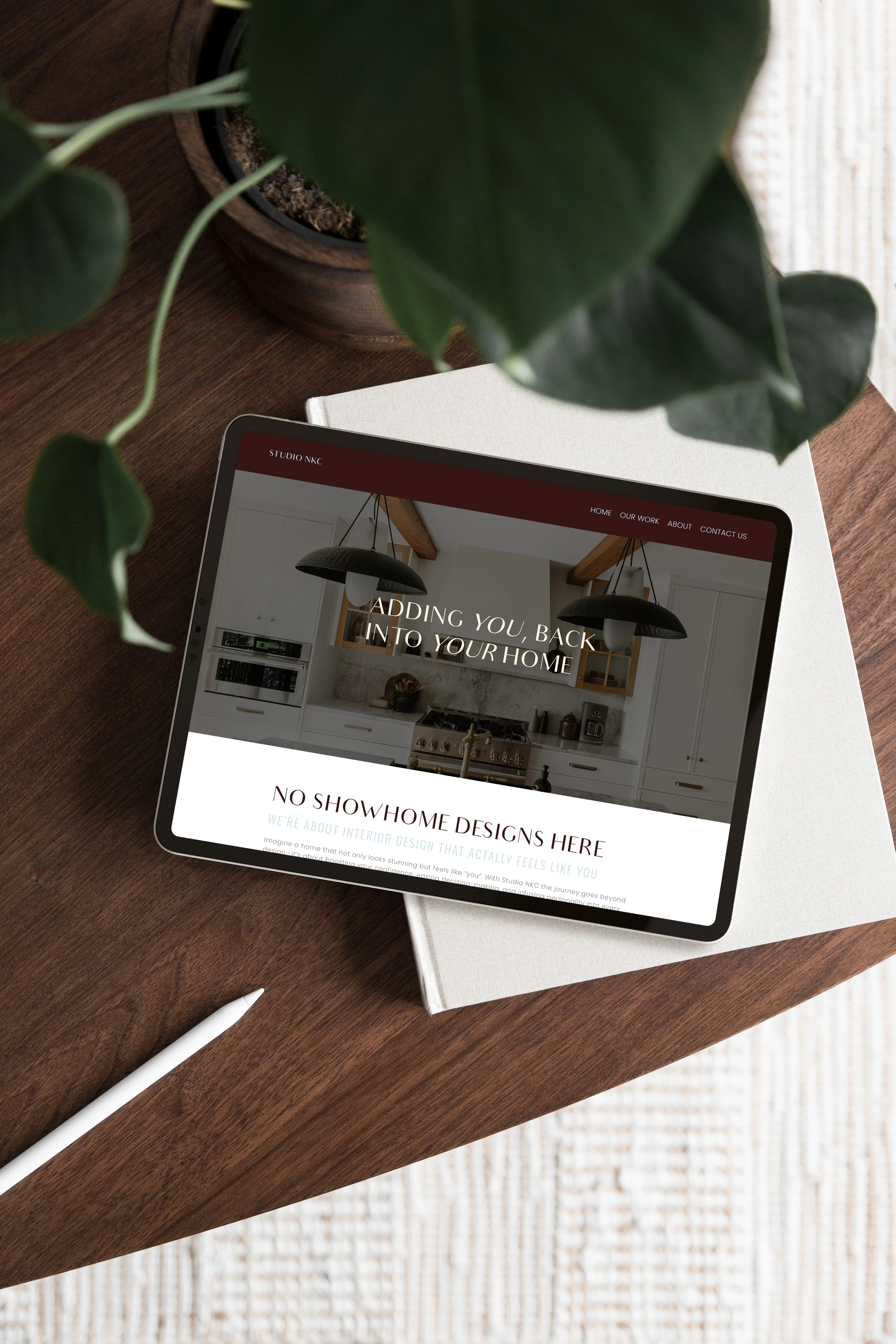
The wordmark and monogram logo system gives Nicole flexibility across every context — from her website header to a business card to a tote bag — without ever losing coherence. The colour palette, drawn from Italian and midcentury references, pairs rich, confident tones with lighter hues so the brand feels elevated without feeling pretentious. Hand-drawn furniture icons and a loose accent typeface bring the warmth and human touch that makes a first-time design client feel like they're in safe hands.
The result is a brand that looks like Nicole, thinks like Nicole, and makes the right clients feel like they've already found their designer before they've even made contact.


“ I've built a base of exactly the kind of clients I was hoping to attract.”
“Working with Kind Design was such a fun collaborative process. Shaylyn is exactly what her brand name says — kind, open to feedback, and patient even when you're picky with colour palettes.
Coming from a designer myself, costs are always a worry — I know how quickly they can creep up when visions don't align. Shaylyn was upfront about pricing and crystal clear on deliverables from the start, which made the whole process feel safe. She immediately understood the vision, and I trusted her completely.
Since launching, I've had enquiries come in without doing any marketing at all. My pitch success rate has gone up, and I've built a base of exactly the kind of clients I was hoping to attract. The brand is doing the work for me — I feel professional and ready to take on the world.”
Nicole caputo | studio nkc
My favourite portfolio projects
Cultivate Business Solutions
Brand Strategy & Identity Design for a Purpose-Driven Business Consultant
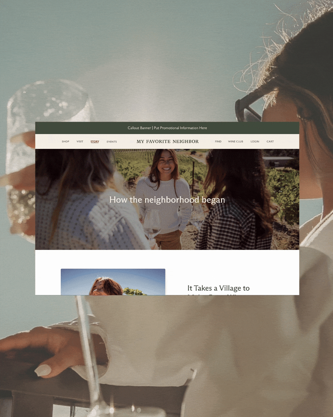
my favorite neighbor
Website for a California -Cool Winery
Forte studios
Branding for a Edmonton Photographer
I’m Shaylyn— a one of a kind designer that prioritize human-connection above all else.
What does that really look like? I design with your audience in mind so that your brand resonates with the people you serve. By asking the right questions and thinking beyond the obvious, we’ll find inspiration in your unique brand story to creates an original brand that’s authentically you and can’t be replicated.
Wether you’re starting from scratch, or ready to elevate what’s already in place I’m here to help you find what makes you special and then make sure the world knows.